


RESERVATION EXPERIENCE REDESIGN (MOBILE)
Team

&
Nikki

Monica
Independent Responsibilities:
User Persona & Story, Competitor Analysis, Synthesis, Toggle Search Feature, Convert Lo-fi to Hi-fi, Prototype
Tools:
Google Workspace, Figma, Trello, Zoom, Slack
Timeline:
2.5 weeks
About Florida State Parks Service
The Florida Park Service is one of the largest in the country with 175 state parks, trails, and historic sites spanning nearly 800,000 acres and 100 miles of sandy white beaches. The goal of the Florida Park Service is to create a sense of place by showing park visitors the best of Florida's diverse natural and cultural sites.

Florida's state parks are managed and preserved for enjoyment by this and future generations through providing appropriate resource-based recreational opportunities, interpretation, and education that help visitors connect to the real Florida.
Problem Statement
Amelia Explorer is a travel enthusiast who feels nervous about choosing her first campsite in Florida. She needs guidance in reserving a campsite that meets all of her specific needs without leaving the Florida State Park’s website in order to have a unique camping experience that is safe, fun, and worth 5 stars.
The Objective
I want to understand travelers' needs and fears when wanting to camp in Florida.
Survey Results
When asked what some of their concerns are when booking a campsite, we received responses such as:
-
“Access to the campsite, surrounding area, and price”
-
“Insects, bears, and weird Florida people”
-
“Location, amenities, safety, and reviews”
This ample feedback - helped us determine that the two most important factors that users consider when choosing an area to visit in Florida are:
location and the activities available.
71.4% of survey participants expressed that they prefer to book a campsite online.


Iterated Objective
How do we make site reservations, park amenities, and nearby activities a simple experience for users on the mobile site?
User Persona
Key Insight
Project Name
.png)
Amelia Explorer helped us conclude that it is necessary to include categories that recommend tailor-made camping experiences in the area they are researching. Also, vice versa, users can search for activities and find campgrounds in that area; both will simplify research and expedite booking.
Research Process
02
Project Name
Contacted Florida State Parks
Analyzed competitor websites
Sent an online survey to collect data
Developed empathy for users
Conducted usability interviews on the state's current website
Implemented the research and data to continue with the redesign

Original Mobile Site


Site & Flow Evaluation
(Of original site)
01
02
03
04
05
Lack of User-Friendly Design
Finding information to complete the reservation process was difficult because the text was difficult to scan.
Not Flexible or Efficient
There was a lack of filters to refine search. The reservation calendar required the page to reload in order to search week by week.
Poor Hierarchy
Pages were overwhelmed with large blocks of text. Not sure where to look first.
Lack of User Control & Freedom
Back and undo buttons were difficult to find. This resulted in things like misclicks or other accidents which are frustrating.
To much Information
Big walls of text make it harder to find information and draw users off the site.
06
07
08
Poor Testing
Attention Notice was on every page and could not be hidden.
Not Suitable for all Ages
Text was very small and difficult to read on a mobile device.
No Attention to Detail
Images are too small, making it harder to grasp details of the parks.
09
10
11
User's Time Wasted
The park and site were listed as available, however upon arriving at the reservation page it was listed as unavailable.
User Pain Point
In order to view the next calendar dates, we had to tap on the left and right arrows which ended up reloading the page. This made the reservation process even longer.
Reservation Info not updated correctly
Even after all the constant tapping and navigating and entering captcha information, in the end the selected site was still listed as unavailable.
Competitor Analysis
After evaluating the Florida State Parks website, we decided to look at competitors such as Recreation.gov and Campspot.
These two competitors truly outweighed all of the features that the FL State Parks lacks such as ratings/testimonials, a map on the homepage, and guest booking options.

Usability Testing
We conducted diverse usability tests, requesting them to complete tasks and be transparent throughout.
The process consisted to:
-
Dream of their next camping trip
-
Search for a state park that they would like to stay at
-
Choose a site
-
Successfully book a reservation.
These are users' direct quotes, concerns, and comments, expressing a lot of confusion about how to complete the tasks given because of site confusion, Florida State Parks' trustworthiness, and layout.
"You have to work hard on this site and I'm kind of giving up"
"This site hurts my brain."

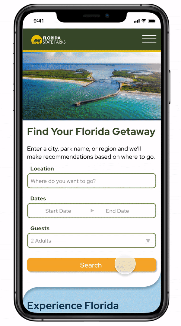
The Solution
Through our research, we concluded to prioritize the flow of the site, making sure users didn't have to go back and forth on a mobile device which will lessen user frustration. Also important was to provide easily accessible details to guide users about activities in the area and highlight features of each campground to make their reservation process quicker and more enjoyable.
Final Brand & Style
-
Clean and easy-to-read sans-serif fonts
-
Bright and beautiful lifestyle and still-life imagery
-
Big and bold buttons to effectively direct users
-
And new color story that introduces blues to accent the beautiful waters of Florida and a new yellow to bring the fresh and energy of Florida, while also keeping the original FL State Parks forest green!

Side by Side Comparisons
MAP
Before


This shows on home page, which helps traveler learn what there is to do in each region of FL
This is on the page when they click on the campground, and shows specific location on interactive map
Search Results
Before

Includes imperative information at a quick glance, can scroll through many photos without opening new page + more
Campground Information
Before


Includes imperative information at a quick glance. Sections can be expanded so scrolling is at a minimum. Can like and share for future use if have an account. Price and important info for travel and booking are easily found.
Results and Final Product
We took all of the feedback from our low fidelity testing and applied it to the final design.
Changes included:
-
Moving the map, getting rid of the pinned images on it, and having it closer to the Florida Experience cards.
-
Reconfiguring the search results. We decided to go with a tab approach, similar to a web browser, so users can gain control and freedom that the original site was lacking.
-
Adding an expand-collapse feature for the reservation details before checking out to pay.
-
And adding digital payment options such as Apple Pay and PayPal
Key Learnings & Takeaways
Developing this website was unlike anything we had ever done before. We learned how to work with a complex online booking and reservation system and make it easier for the user with a very short deadline. We enjoyed that we can truly make a difference in people's lives by improving user experiences. Despite the challenges, the results were highly rewarding.
Next, we plan to design a desktop browser prototype and pitch the design concept to Florida State Parks. Hopefully, we can start making all campground websites better!
Let's get in touch!
The perfect time is now!
Let me help you turn your dreams into reality!
407.721.3161
