

Website Re-design
Role: Nikki Hanacek - UX/UI Designer, Consultant, Product Manager
Website: https://fastendepot.com/home-1
The Client
FastenDepot is an E-commerce company that sells fasteners to large corporate industries such as marine, construction, and building. This stakeholder reached out to me excited to improve their amateur site so their new but extensive company can continue to grow. During our first thorough consultation, there were many ideas and expectations included.
The Objective
For Stakeholder -
Uncover stakeholder's thought processes about what they think is not working with the current site.
For User -
Discover users pain points about ordering fasteners in bulk.
Research Results
By using open and probing questions I revealed that the stakeholder's goal for the redesign is to be better than the competing companies and make the site look up to date. I also discovered that customers are having difficulty ordering products in this industry because there are an overwhelming amount of options. Customers may not know the exact fastener that they need or don't have time to search and scroll through thousands of SKUs.
The Challenge
With so much excitement from the stakeholders, there were many ideas proposed for the redesign. My biggest challenge as the project manager was to keep everyone focused on the scope. I enjoyed practicing active listening while we were ideating and jotting notes down for future improvements.
Competitor Analysis
Prior to meeting, we briefly spoke about some competitors' sites that he liked or didn't. My research before meeting was greatly appreciated, as my annotations on my competitor analysis pages made our design thinking process easier and more efficient. These are just a few pages that were most relevant, even though I was happy that I dug deeper into research, which is not shown.
.jpg)
01
.jpg)
02
03
01
Request a Quote: This feature is a priority for users that are industry leaders lacking time to search or go through minute details of products. I suggested this would be a good section to quickly request products. We included the option to attach documents like previous orders or inventory, which made this step even easier.
02
Hero Image: Incorporating a hero section would help catch the user's attention for the most pressing information. I appreciated the product photos for customers to know what category to click on.
03
To much information: We all agreed that we did not want a page to look like this, it is too overwhelming, as well as not necessary for the scope we were focusing on.
Original Site Home Page
Even though the site presented all that the company offered, it was not very inviting and didn't show the true culture or brand.
Heuristic Evaluation
Buttons:
-
Didn't go to the intended or expected page
-
Didn't work at all
-
The call to action in the Hero section "want to know more" was confusing. I thought "What am I going to know more about?"
-
I appreciated that all of the buttons were the same so users knew what the call to actions were
Navigation Bar:
-
I didn't like how it items were split around the logo, looking across the screen with a lot of white space can be unclear
-
The more button shouldn't be used here unless necessary, increases clicks for the user
-
The 3 icons - search, cart, and account - didn't work and won't be needed for the site currently
Design
-
Hero Image and section could be improved
-
"See coverage areas" section was a necessity but needed to be shown better
-
Necessary to make "3 photo sections" look better, with drop shadow, same size photos, improve copy
-
I didn't like the placement of subscribe button, I don't think it is more important than the "need a quote" section
-
I was happy to see there was a quote box included but it needed improvement


The Solution
We decided to clearly present how this service sets FastenDepot apart with an about section on the home page. We focused our scope on incorporating their top-notch customer service team and portraying that they will be treated like family. With this goal in mind, not only will the design of the site improve but so will their product sales.
Redesign Improvements
Buttons:
-
To accomplish an easy-to-use clean site, I wanted most of the information to be on the home page and accessible by scrolling.
-
Used minimum buttons: "See locations", "Download Product PDF", "Call or Request a quote", and "Send" the quote info.
Navigation Bar:
-
Condensed Nav Bar to 4 clear items
-
Took away empty space and aligned them on the right
Design
-
Added full-width slider scrolling hero above the fold, including bold, concise, and appealing verbiage
-
Stakeholders requested to keep their red but the site needed a contrasting accent color. I found the split complementary color teal and they loved it
-
We wanted an easy to read product overview so I designed a section broken into categories, big enough to scan quickly
About
-
Stakeholders wanted to provide the copy so I made improvements in grammar and proofread
-
Since the about section is the focus of the company I highlighted enticing headers and brief but explanatory paragraphs, which shared the company vision and culture
-
Deleted the unnecessary photos under the service section and asked for copy for the most important information we want customers to know
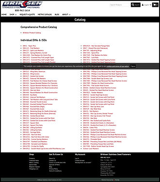
Final Design
.png)
.png)
.png)
Extra Designs
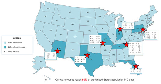
Some extras that were requested was a customized map showing all shipping locations that wasn't overwhelming and easy to understand, as well as a Line Card PDF, to print and hand out at conferences and shows, also included on the site.

Let's get in touch!
The perfect time is now!
Let me help you turn your dreams into reality!
407.721.3161
